Apple route descriptions as a basis
The method Apple uses to collect the data is relatively simple: When Apple Maps is used to search for directions or request traffic data, the query registers the system, which must necessarily provide an answer. For reasons of data protection, however, this is not linked to the Apple ID, so it remains anonymous.
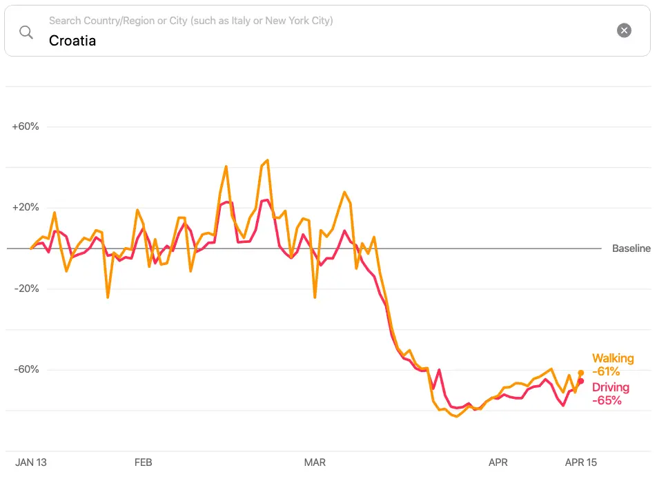
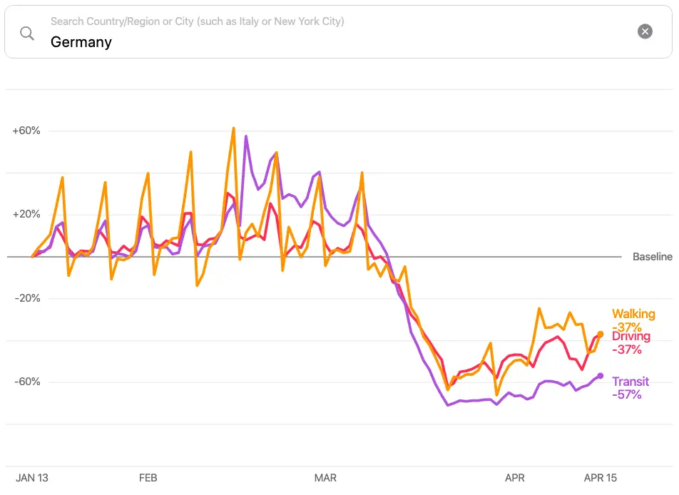
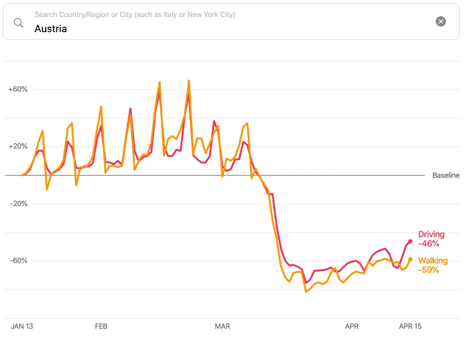
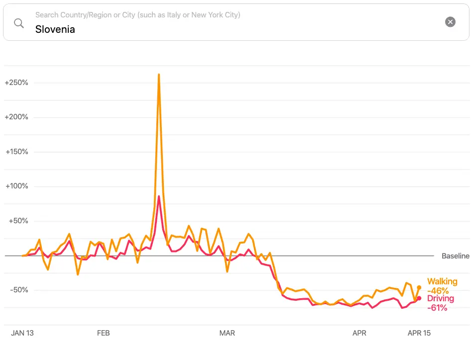
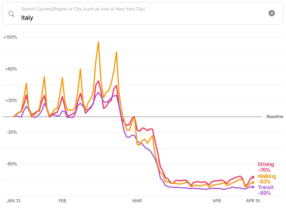
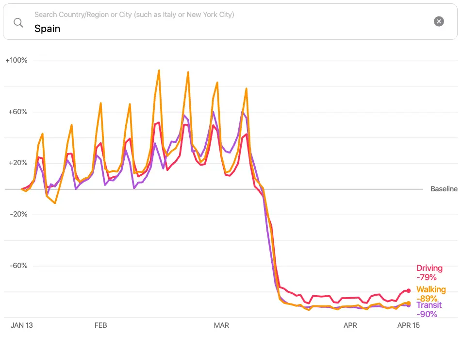
Apple has now evaluated the corresponding data and created graphics for the period from January to April, which provide information about the progress of the queries. They apply in each case to pedestrians, motorists and in some cases also to transit.
Sharp decline in mobility in Croatia
In Austria, for example, car traffic fell by 49 % after the lockdown, and pedestrian enquiries by 65 %. In Croatia, private car traffic fell suddenly by 69 %, the number of footpaths by 71 %. Slovenia is almost on a par: 65% fewer enquiries from pedestrians, 67% fewer from motorists.
However, the analysis is really interesting in the case of Germany and Italy: while Germans have apparently only stopped driving 39% and walking 45%, Italy shows what lockdown means: 78% less private transport and 85% less pedestrian activity.
The data presented here is a snapshot of 16 April 2020, but if you want to keep track of the current development, you can find the graphs at Apple Website.
Data confirm discipline of the Croats
We believe that here you will find interesting data for comparing countries, which show how the population adheres to the prescribed measures. They should actually serve governments and health authorities as a basis for recommendations for action, but private individuals can also form their own opinion on the basis of the data published by Apple and the course of events. However, we leave the interpretation to the readers.


